Overview
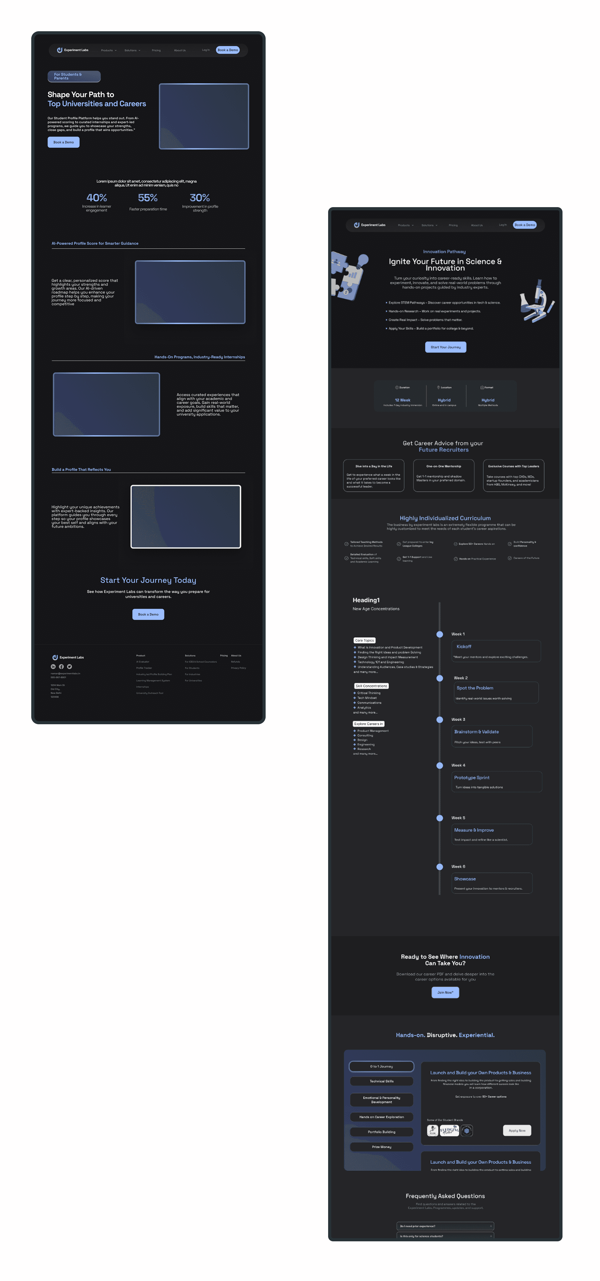
Experiment Labs is an edtech SaaS platform built for study-abroad consultants — helping them manage student journeys, track progress, and deliver profile-building services. The platform had real users and steady traffic. What it didn't have was a website that could explain any of that clearly.
Over two months, I led the end-to-end redesign from research to final handoff — as the sole designer.

The Problem
Visitors couldn’t easily understand what Experiment Labs does, leading to confusion and missed conversions.
Experiment Labs had a 2.1% conversion rate despite consistent traffic. That number pointed to one thing: people were landing on the site and leaving without understanding what it was for.
The platform served two very different audiences — consultants who run their practice on it, and students who access it through those consultants. The old site treated them as one. The messaging was muddled, the navigation was cluttered, and there was nothing to earn trust on first impression
Company Insights
Through interviews with the founder and stakeholders, I learned that Experiment Labs was simultaneously targeting two audiences:
Education Consultants (Primary Users) – They use the platform to manage students’ journey, track progress, and offer guidance.
Students (Secondary Users) – They access the platform (via consultants) to explore career-building programs and mentorship opportunities.
This duality wasn’t clearly communicated in the old website, leading to confused messaging.
Research
I interviewed students (14–18), parents, and consultants. The pattern was consistent across all three groups — not confusion about features, but confusion about what this platform is and why it exists.
Parents were already spending heavily on study-abroad applications. They needed to be convinced this added something real, not just another service in the stack.
That reframed the design problem: this wasn't about simplifying navigation. It was about building enough clarity and credibility that the right person could immediately see themselves in the product.
My Contributions

The Awkward Phase
Exploring multiple directions and refining ideas with the team.

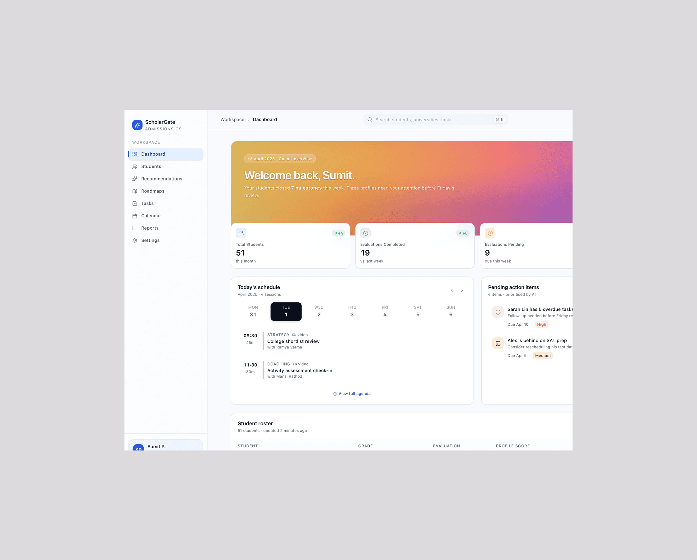
✨ The Glow-Up
The final design with a clear, polished identity.