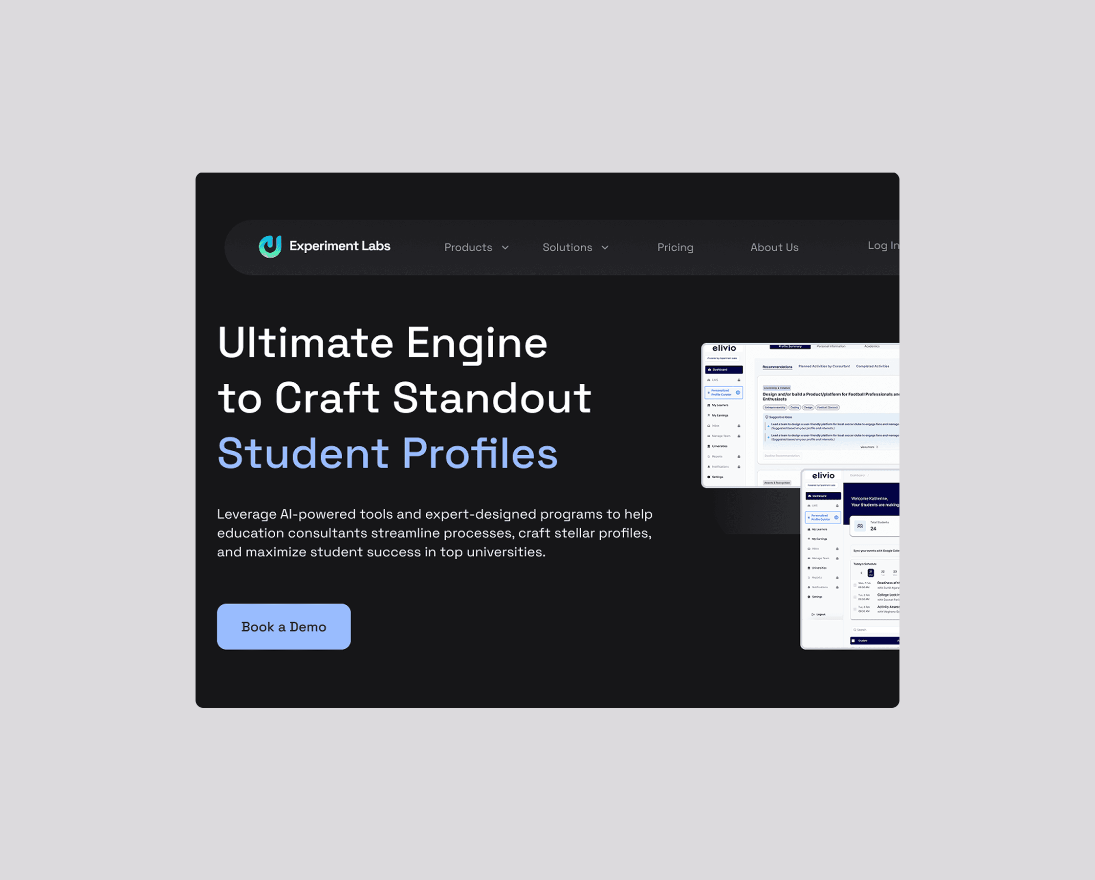
A system that transforms how education consultants guide students — replacing fragmented workflows with an AI-assisted platform that surfaces personalized recommendations and keeps students on track.
March – June 2025 · 4 months
Sole Designer
B2B SaaS · Product Design
Figma · Claude
OVERVIEW
I was the sole UI/UX designer for ScholarGate, an AI-assisted guidance system for education consultants helping students prepare for study abroad applications. Over 2 months, I designed end-to-end experiences for both consultants and students.

Consultant dashboard - the starting point
PROBLEM
The process of helping students build stronger profiles was fragmented, manual, and didn't scale — leaving no room for personalization.
Education consultants manage dozens, sometimes hundreds — of students preparing for international university applications. The work was fragmented: spreadsheets, WhatsApp, email.
But the real problem ran deeper than disorganization.
Through conversations with the PM and stakeholders, I uncovered three core issues:
😕
Observation #1
Consultants had no scalable way to personalize. Every student got generic advice because real personalization meant hours of manual work per student. How do you guide 50+ students individually?
Observation #2
Students felt lost. They had no roadmap, no progress tracking, no sense of which activities actually mattered. This meant consultants spent more time motivating than advising.
😣
😕
Observation #3
The process was invisible. Parents couldn't understand why activities were recommended. Consultants couldn't easily show what a student had accomplished.
Aha! moment
This reframed the entire product vision: from a CRM into an AI-assisted guidance system. The AI's job wasn't to replace the consultant — it was to make their judgment scale.
GOAL
I wanted the experience to feel:
Motivating instead of stressful
Structured but not rigid
Gamified without feeling childish
Supportive and progress-oriented
The platform should reduce decision paralysis and help users feel capable, not small.
My design philosophy: Clarity beats features. Surface the most important information first. Keep the human in control.
A walkthrough of the core workflows and the design decisions behind them.
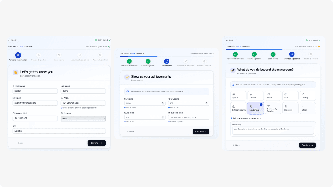
#1 Progressive Student Onboarding
The problem
Students were expected to provide extensive academic, extracurricular, and personal information in a single form. Many found the process overwhelming, leading to incomplete submissions.
My approach
I broke the intake into five focused steps, each with a single objective, clear progress indicators, and contextual guidance. This reduced cognitive load while helping students understand what information was expected at each stage.
Outcome
Students moved through the onboarding with more confidence, resulting in a lighter, more structured experience.
#2 A Consultant Workspace That Prioritizes Action
The problem
Consultants managed dozens of students simultaneously and needed to identify priorities quickly without scanning multiple screens.
My approach
Instead of exposing every metric, the dashboard surfaces only what requires immediate attention: today's meetings, pending reviews, overdue tasks, and student progress — while secondary information stays one click away.
Outcome
Consultants could quickly understand where to focus without information overload.


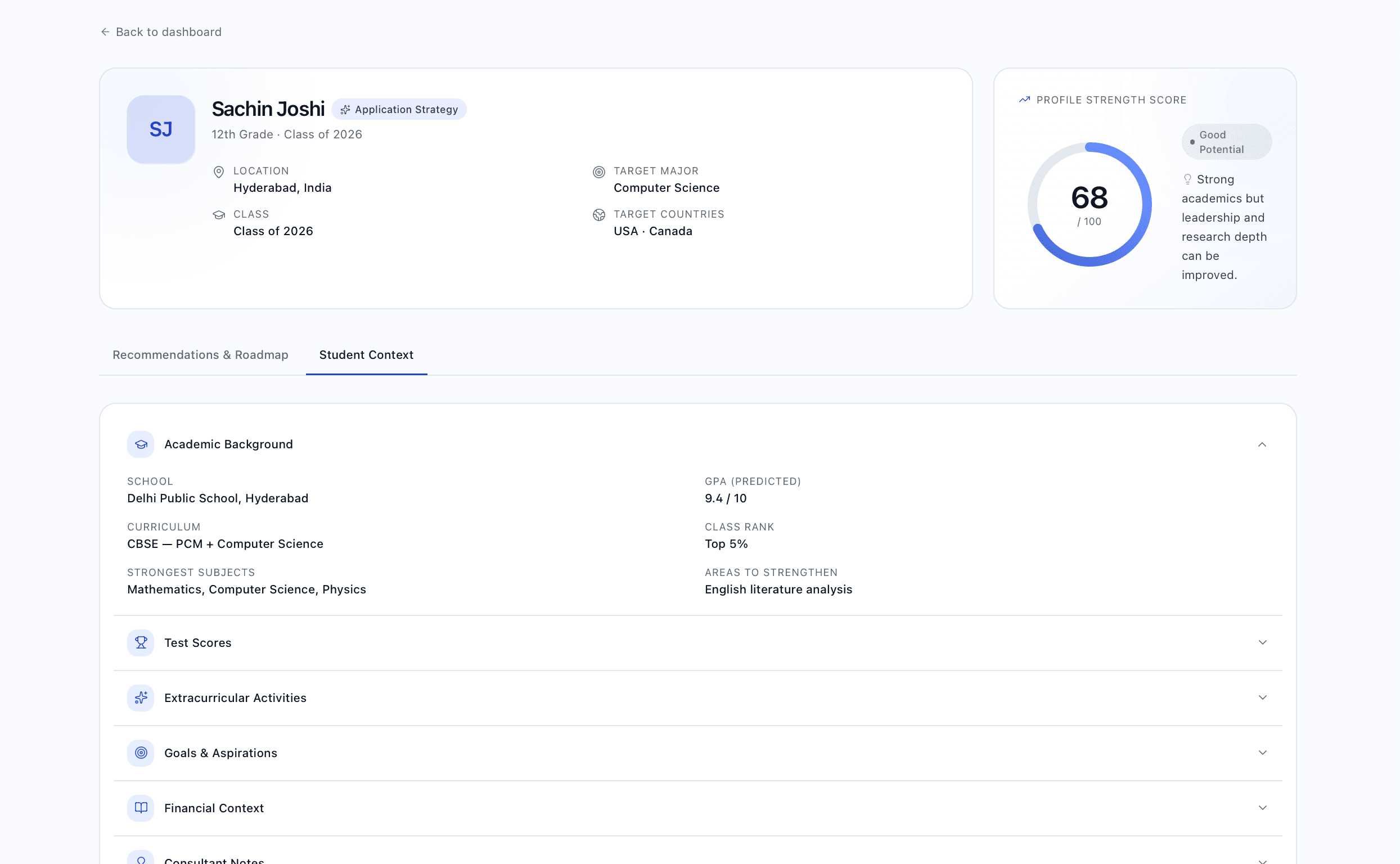
#3 Making Student Profiles Explainable
The problem
Parents and consultants often questioned why the AI recommended certain activities because they no longer remembered everything the student had entered.
My approach
I designed a consolidated student profile that combines student information, AI recommendations, and the original intake context in one place. Every recommendation links back to the specific student input that generated it.
Outcome
Consultants could quickly understand where to focus without information overload.
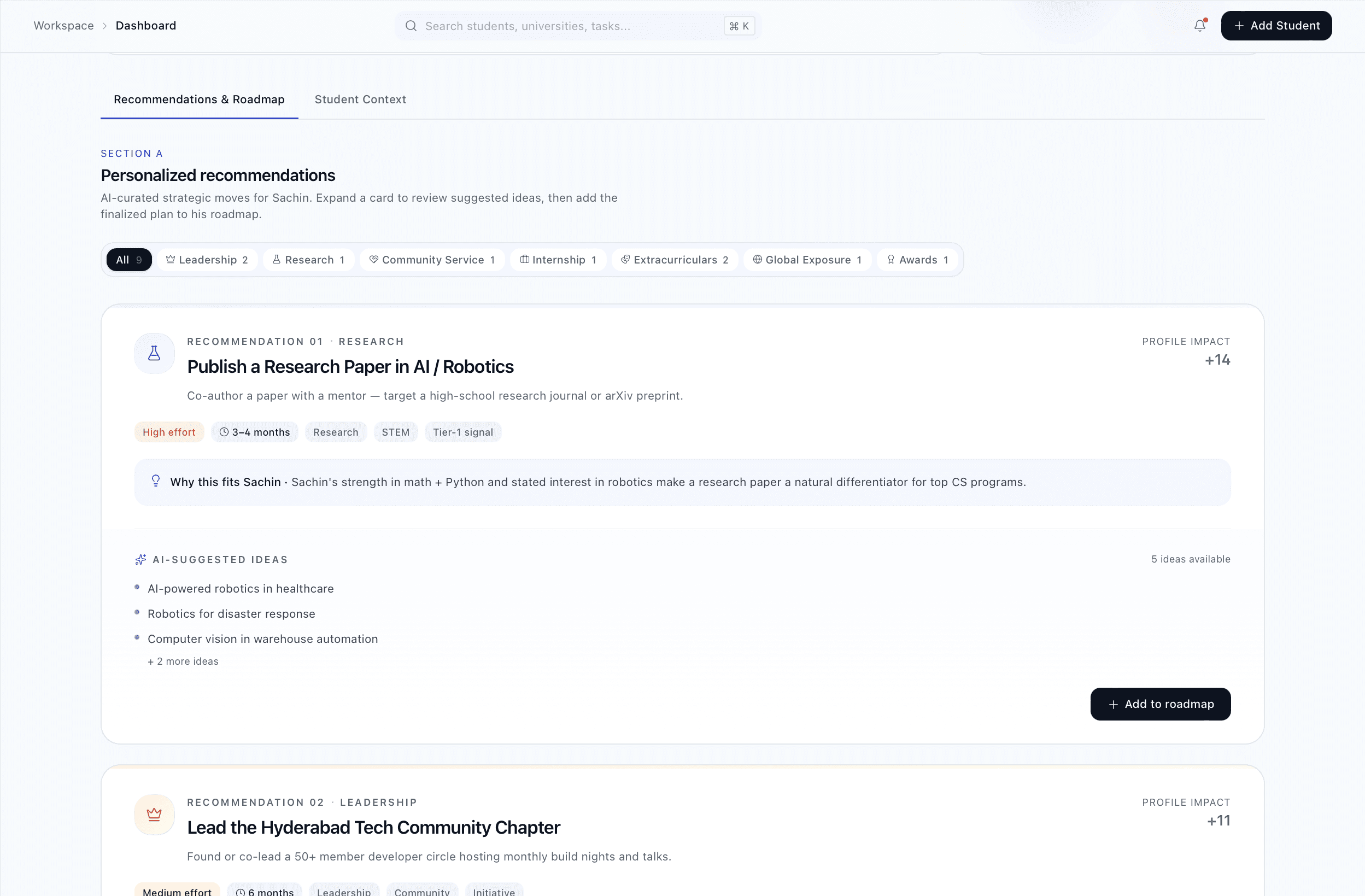
#4 Designing AI Recommendations People Could Trust
The problem
Automatically generated recommendations created hesitation. Consultants wanted guidance—not decisions made for them.
My approach
Recommendations are grouped by skill area and explain:
What to do
Why it fits the student
Expected impact
Estimated effort
Timeline
Consultants review, edit, customize, or discard every recommendation before adding it to a student's roadmap.
Outcome
The AI became an assistant rather than an authority, keeping consultants in control while reducing manual effort.

#5 Turning Recommendations into Actionable Roadmaps
The problem
Recommendations alone weren't enough. Students needed a structured plan they could actually follow over time.
My approach
Approved recommendations automatically become milestones within a roadmap. Consultants can adjust dates, priorities, and dependencies, while students track progress through visual completion indicators.
Outcome
Abstract goals became structured, measurable action plans.

#6 A Dashboard That Keeps Students Motivated
The problem
Students often lost visibility into their long-term progress and upcoming milestones.
My approach
The student dashboard highlights profile strength, active milestones, completion progress, and upcoming deadlines. Rather than showing every detail, it focuses on what students need to do next.
Outcome
Students could clearly understand where they stood and what actions would move them forward.

ITERATIONS
Original: Single-page form
Problem: Students disengaged before finishing
Solution: Progressive 5-step form with interactive inputs
Result: Lighter experience, improved completion
Original: Showed all recommendations at once
Problem: Decision paralysis
Solution: Grouped by skill area, impact scoring, collapsible cards
Result: Consultants could quickly identify high-impact activities
OUTCOMES
The platform launched and is in use with real education consultants and students.
Key Results:
Consultants can manage students at scale without losing personalization
Students feel clearer on next steps and track progress
Manual recommendation work reduced by ~60%
Trust in AI recommendations increased due to transparency
Decision paralysis decreased for both consultants and students